For many years, I explored a theme called Running Man that revealed to me that I too was a running man, neglecting the important parts of life by chasing success and worldly concerns. As they say, artists always make self-portraits. After that, it was time for me to begin exploring my inner woman, so as a counterpart to the Running Man series, I developed the Dancing Woman series. The first piece in the series was called the Three Graces, originally designed as a maquette to be scaled up into a larger piece.
The Three Graces
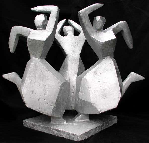
This piece was a further effort to explore the problem of depicting women in art without succumbing to stereotyping about Beauty, the Eternal Woman and the rest of it. This problem is discussed in more detail in another blog .

Images of The Three Graces goes back to antiquity. Wikipedia says in Greek mythology, the Graces ordinarily numbered three, from youngest to oldest: “Splendor”, “Mirth” and “Good Cheer”.
In 1482 Sandro Botticelli included Three graces in his painting Primavera.

There is the famous oil painting by Italian painter, Raphael, who in turn was inspired by a ruined Roman marble statue in Siena, shown below, that was in turn a copy of a Greek original.


Also below is Antonio Canova’s (1757 – 1822) version in marble. He was an Italian sculptor who became famous for his sculptures that delicately rendered nude flesh. His work is the epitome of classical refinement.

My sculptural version of The Three Graces is the opposite of delicately rendered nude flesh for reasons I have explained elsewhere. I am breathless with admiration for the technical ability of those painters and sculptors who were able to take paints or stone and turn them into a timeless msterpieces. But that was then and this is now. The problem for contemporary artists is that the female form has been used so often that it has become a cultural icon used to convey shallow, sentimental ideas about women that are conventional and formulaic. This is why my version of the graceful trio is made from flat planes to create monumental, powerful angular figures. This seems closer to the original conception of the Graces as goddesses of “Splendor”, “Mirth” and “Good Cheer.
But for the last four centuries, endless, ubiquitous, egregious representations of delicately rendered female flesh have become an issue. It became an issue, largely because of the women’s movement and a general critique of gender inequality. But the role of women in the arts was raised to the public consciousness most brilliantly by the Guerilla Girls. In 1989, this artists’ collective was asked to design a billboard for the Public Art Fund (PAF) in New York. They conducted a “weenie count” at the Metropolitan Museum of Art in New York, comparing the number of nude males to nude females in the artworks on display. The results were very “revealing” and were used in the design they submitted shown below.

The PAF said the design wasn’t clear enough (????) and rejected it. The Guerilla Girls rented advertising space on NYC buses and ran it themselves, until the bus company cancelled their lease, saying that the image, based on Ingres’ famous Odalisque, was too suggestive and that the figure appeared to have more than a fan in her hand.
The problem of delicately rendered female flesh was explored in the early 1970’s in a collection of essays, later televised, called Ways of Seeing, edited by John Berger. The essays raise questions about hidden ideologies in visual images. One essay focuses particularly on the female nude as a subject for art which depicts women as a subject of male idealization or desire, rather than as herself . An example is Venus & Cupid by Lely shown below.

This portrait of his mistress was commissioned by Charles the Second. It shows her passively looking at the spectator staring at her naked. Berger calls her expression “…a sign of her submission to the owner’s feelings or demands.”
Berger contrasts this Western tradition of painting languid nudes to non-European traditions, such as Indian, African & Pre-Columbian art where “…nakedness is never supine in this way.”
The question posed on the Guerilla Girl’s website is: DO YOU THINK THINGS HAVE GOTTEN BETTER SINCE OUR FIRST COUNT IN 1989? As a sculptor, I am naturally interested in how often women are successful in sculpture & public art competitions or how well they are represented in exhibitions and galleries. So to answer the Guerrilla Girls’ question, I checked “sculpture” on Wikipedia and did a back-of-envelope gender analysis of the sculptors represented there. Only about 5% of the artists mentioned are women in what should be a progressive source of information on sculpture. An apologist might say that women don’t want to be sculptors because it’s too difficult for them, or they are not strong enough or something along those lines. For instance, when I was at a sculpture symposium in China, I asked why there were virtually no Chinese women sculptors among the 60 or so male sculptors participating. The response I got from male sculptors was that sculpture is dirty work & women don’t want to do it. A more likely scenario is that China, like most of the world, discriminates against female sculptors in terms of acceptance for sculpture training and granting of commissions. If in fact there are fewer female than male sculptors per capita in the West, it would be my suspicion that women chose another field because sculpture has remained a macho preserve. And even if there were as many female sculptors as male, there is clearly a strong gender bias at work in terms of getting work & recognition.
Though the Guerilla Girls are still very much the “conscience of the art world” I hadn’t seen any sign of them in my home town of Vancouver for decades. I was reminded about their artwork by an exhibition of feminist art at the Centre Georges Pompidou in Paris that featured them. Another of their brilliant and biting pieces is the following:

I love their work and wish we could see more of it. The contemporary art scene tends toward works that are careful not to take a stance on identifiable issues or real-world problems. An artist may allude to an issue, preferably taking an obscure approach that could not be said to present a point of view. But using art to clearly present an opinion is considered didactic, and contrary to postmodernism’s rule that the viewer’s interpretation is paramount and must not be determined by the creator. That’s why re-visiting the Guerrilla Girls was such a breath of fresh air.
Running Woman
To continue the series of dancing woman, I developed another image called Anima. It was first built as a maquette, shown below.


This maquette was an homage to Picasso‘s wonderful painting, Two Women Running on the Beach (The Race) (1922).
I loved the monumental qualities of the women, their strength, freedom of movement and obvious joy. It was fun to try to capture these qualities in intersecting flat planes.
It’s interesting that a confirmed misogynist like Picasso would come up with the most powerful images of female freedom and strength. That is because, though he was clearly a genius, his genius did not extend to the emotional sphere.
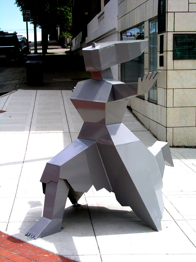
Anima was about the true inner self of an individual, as opposed to the persona or outer aspect of the personality. The sculpture is a celebration of the female principle, depicted using flat planes in a cubist/constructivist style to express strength. Anima also refers to the joy and momentum that I was seeking to express in steel.
In collaboration with my partner, Colin Race, the 13″ high maquette was translated into a 68″ high sculpture (5+ times as big) shown below. To scale the model up, I outlined each part & used a pantograph to increase the scale. Due to the limits of my cheap pantograph and workspace, I seem to remember I had to increase the scale by 2.5 then increase those drawings again by 2.5. I drew each part on cardboard then attached all the pieces together as a rough model to see if they would fit. To construct it in steel, we built the skirt first which created a stable base for attaching the upper body & legs. Due to small cutting errors, the dimensions of the original cardboard templates had to be modified as the sculpture progressed. Unfortunately, it didn’t occur to me to photo-document the process at the time. The finished sculpture currently resides in the
This experiment was quite successful, except that I wanted to leave the surface in polished mild steel with a clear finish as shown above. I spent hours researching a finish that would prevent rust & not yellow, or peel off. I found all kinds of extravagant claims for aliphatic urethane coatings that were alleged to prevent mild steel from rusting and last forever. So we used oiled & pickled mild steel, polished the picking off and clear coated Anima I with Aliphatic Urethane. But the steel started to rust underneath the clear coat within a few months of the rainy season. The clear coat was lasting well, but rust is almost impossible to eradicate, and it showed through the clear coat. We ended up having the urethane media blasted off and re-finished the sculpture with a silver powder coat.

The finish is not as silvery as I had hoped (though above photo taken on a rainy day), but it still looks great and is a lasting finish. The only way to get a really silver finish is by using stainless steel, and I can’t afford it for spec sculptures.
The Anima I design presented fabrication challenges as all the intersections were ground smooth which took a lot of difficult, labour intensive work. So the design for Anima II was made up of cubes, rather than intersecting planes. It was also away to test our fabrication capability for the eventual construction of my design for The Three Graces at the beginning of this blog. I submitted the drawing of Anima II shown below to a call for public art in Bremerton Washington and the drawing was accepted for a commission.

I used the same skirt design as Anima I, which again provided a stable base for constructing the legs and upper body. I didn’t make a cardboard model, but just waded in, using the cardboard templates from Anima I as a guide. But they were soon useless so I ended up using big sheets of tracing paper to create a pattern for each piece of steel. It was sort of like designing pattern pieces for making a dress.
As the caption shows, at the time of this submission I still wasn’t aware that no clear coat can be made to adhere well to bare steel, There just isn’t enough body for it to work. So I hadn’t factored into the budget getting the piece powder-coated.
Because the sculpture would be in a seaside location, I was advised to use a zinc-rich primer which is a very dark grey. The silver colour coat was not opaque enough to completely cover the primer, so the finish is less silvery than I had wished. Live & learn. If I were to do another piece like this in future, I would get it media blasted and spray-painted as you can keep adding layers of paint until satisfied. With powder coating, you can only add 2-3 coats max (primer, colour & clearcoat).
Not having worked in Washington before, I was also not aware that there would be sales taxes. And at about this time, the US border suddenly tightened up and we could no longer talk our way through without paying a brokerage fee and getting our Ford Ranger Pick-up registered as a Standard Carrier with the National Motor Freight Traffic Association. If it wasn’t such a waste of time, it would be funny to see us in our little red pick-up with some odd sculpture in the bed lined up for hours with rows of giant semis. Then there are more fees to actually get across the border.
The paperwork alone takes so much time away from doing any actual artwork that we now avoid bringing any sculptures into the US. We used to exhibit in many of the shows just across the border and really enjoyed meeting all the sculptors & sculpto-philes to the south. Just one small illustration of the many ways in which the new Security State is strangling the culture..
To add insult to injury, the reception from the man-on-the-street during installation was lukewarm. Apparently there were differences of opinion in the community as to whether or not the City should be cluttering up the streets with public art.
Ironically, given its reception, Anima was meant to convey a positive message. As quoted in the Kitsap Sun:
“It’s a strong piece about optimism,” Jamieson said. “I hope people will get a feeling of optimism and hope. We’re going into the future with our heads held high and a bright outlook.” Well, I didn’t exactly say that but that was the gist of it.
As a further irony, the locals began to drape the sculpture in clothes. The local Arts Council framed it as positive interaction but the Mayor checked in with me as to whether or not I was offended by this. But to me, once a sculpture is out in the public realm, I no longer feel wedded to the original concept and if this is the way the community chooses to take ownership of the piece, so be it.
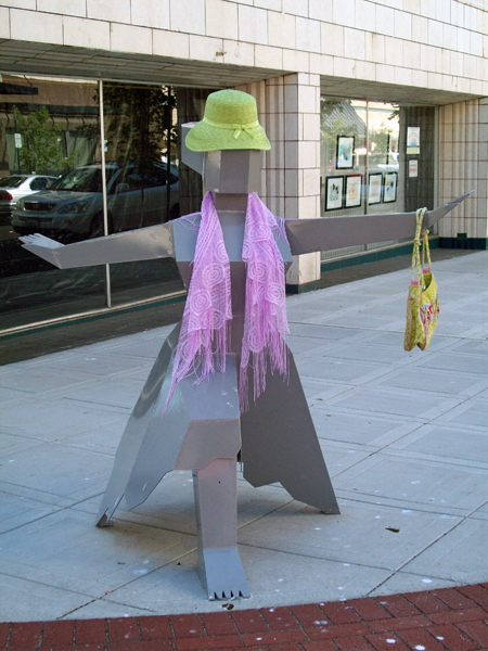
Having said that, I am not comfortable with this fad, and I have seen great sculptures in Seattle that have been draped in clothes. Maybe this is community involvement or maybe this is a fundamental disrespect for art. Or this could be part of the postmodern attitude in which everyone is an artist.
We travelled to Bremerton one last time to maintain the sculpture and removed not only the accessories shown here, but a sandwich-board advertising local fundraising activities. The sculpture had graduated from mannequin to kiosk. While we were cleaning the sculpture, people were waiting in a car for us to leave so they could replace their advertising.
In addition to its advertising function, the sculpture was serving as part of a skateboard obstacle course and there were rubber skid marks up the skirt. We tried everything to remove them and finally hit on toothpaste! For future reference, Crest with Flouride does the trick.
Like all of my experiences in art, Bremerton was a learning experience – mostly on how to combine artistic sensitivity with a rhinoceros-like hide.
After the Dancing Woman and Anima series I had not finished exploring my inner woman and years later, after returning to painting as my main medium, I came back to the theme but with a different approach. This approach is described in a later blog.